Bringing sponsorships to life with multi channel content designed to create ‘buzz’
McDonald’s Victoria tasked perrycallan with creating a range of content that promoted the fact that all McCafe Baristas are trained at McDonald’s very own Barista Training Academy, and that needed to be linked to activities McDonald’s were sponsoring at the time with relevant talent.
perrycallan created the term ‘Natural Born Baristas’, wrote all the content, interviewed the talent and creatively directed the filming and editing of videos.
Content was then created to be used across digital, radio, television and in store channels.
Hotondo TVCs
Differentiating on emotion when everyone else is mistakenly functional
perrycallan has worked with Hotondo Homes for the last five years, since the agency was founded. Hotondo Homes is a national home building franchise business of more than 80+ franchisees who rely on master franchisor to build a strong and differentiated national brand to ensure their own individual business success. perrycallan identified that the home building category heavily relied on price promotions and special offers – which is in conflict to the main psychological decision making process of building a new home – so recommended a more emotional approach to cut through, differentiate and ensure Hotondo Homes is in the consideration set of people wanting to build a new home.
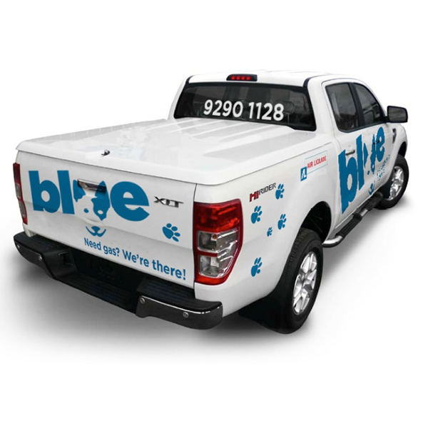
BLUE from Air Liquide
Branding a new, ‘swift offering’ for SME’s from a multi-national
Air Liquide, the French global gas company, wanted to compete in the SME sector in Australia against swifter, more customer-focused local offerings.
perrycallan was tasked with creating a name, logo and visual identity system that would truly differentiate this new offering from the core Air Liquide ‘master brand’ and directly connect with the small business target.
Taking inspiration from the Air Liquide’s main corporate colour and the colour of the actual product when it burns along with a dose of Aussie spirit, the name ‘BLUE’ was devised and then brought to life to represent friendliness and dependability.